This graph displays the death toll statistics of a day, a year and events in history while directly comparing them to the current world population.

Source: mmcportfolio.com
This graph displays the death toll statistics of a day, a year and events in history while directly comparing them to the current world population.
Source: mmcportfolio.com
Here are some of the reasons why we should always drink water. (Trivia: While making this infographic, I’ve had about 4 glasses of water)

See where it is best to have children according to the Economist! See how the Economist Intelligence Unit their rankings have changed from 1988 to 2013 in this infographic and while some big players are under performing like the US, UK and France, see how places like Taiwan are creeping up to the top spot, held at the moment by Switzerland.
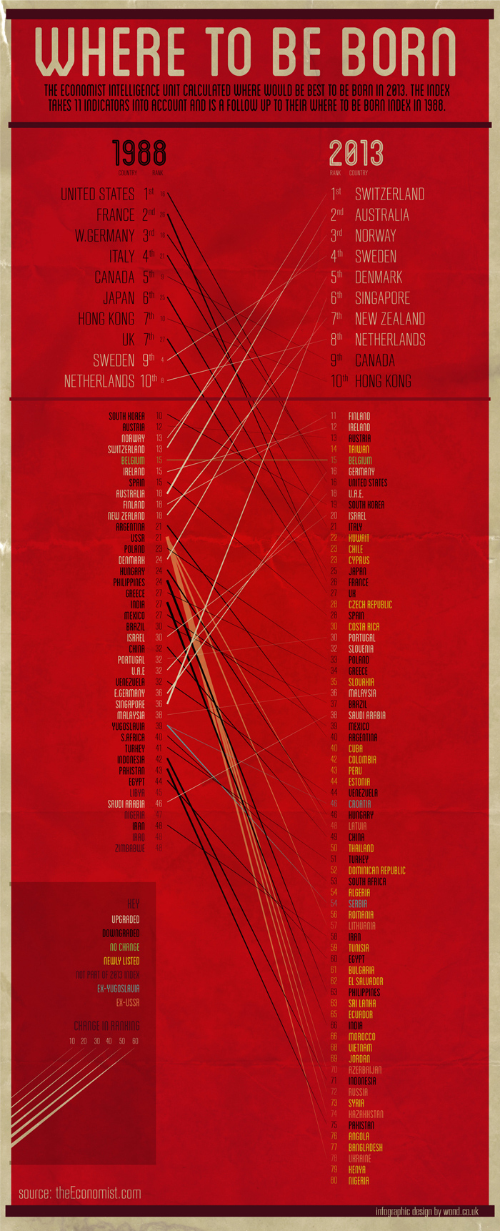
Source: wond.co.uk
Most people know the four blood types, A, B, AB, and O but lesser known are the Japanese personality traits associated with each blood type. This infographic contains blood related facts such as blood donation requirements, diseases requiring blood donations, and more.

